top of page

Web.com Brand Strategy and Visual System
Web.com Brand Strategy & Visual Identity System
Web.com was competing in a crowded technology market alongside established names like GoDaddy and Wix. The company set out to refresh its brand with three clear objectives: modernize its identity, differentiate itself through a more empowering and simplified customer experience, and build internal excitement around a renewed set of core values.
I was brought in to help translate that ambition into a cohesive brand and visual identity system. The work included a modernized logo, a new visual language, and a set of actionable brand elements designed to work across the company's digital and internal communications.
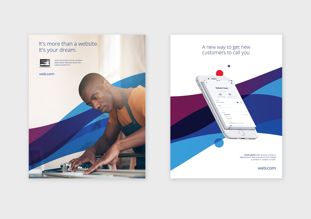
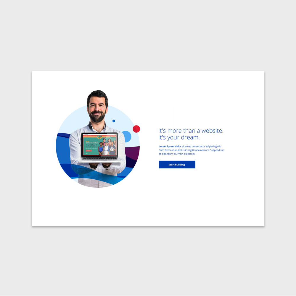
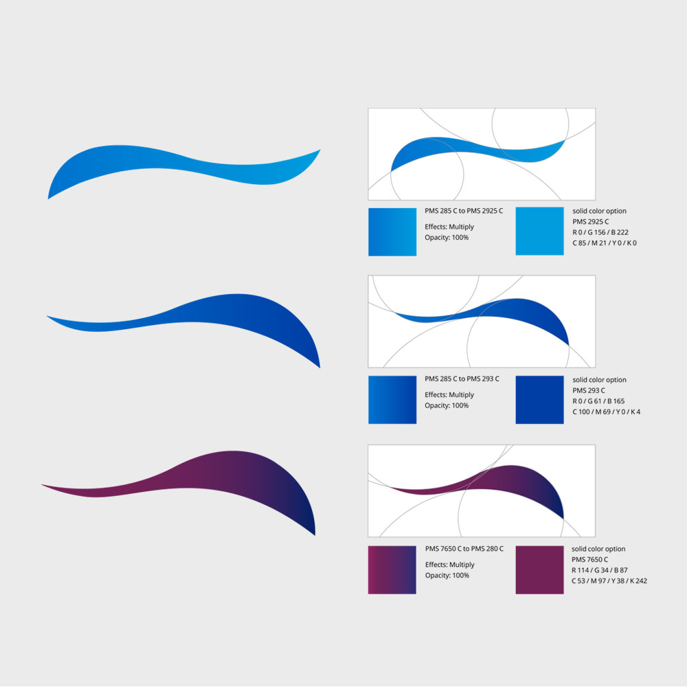
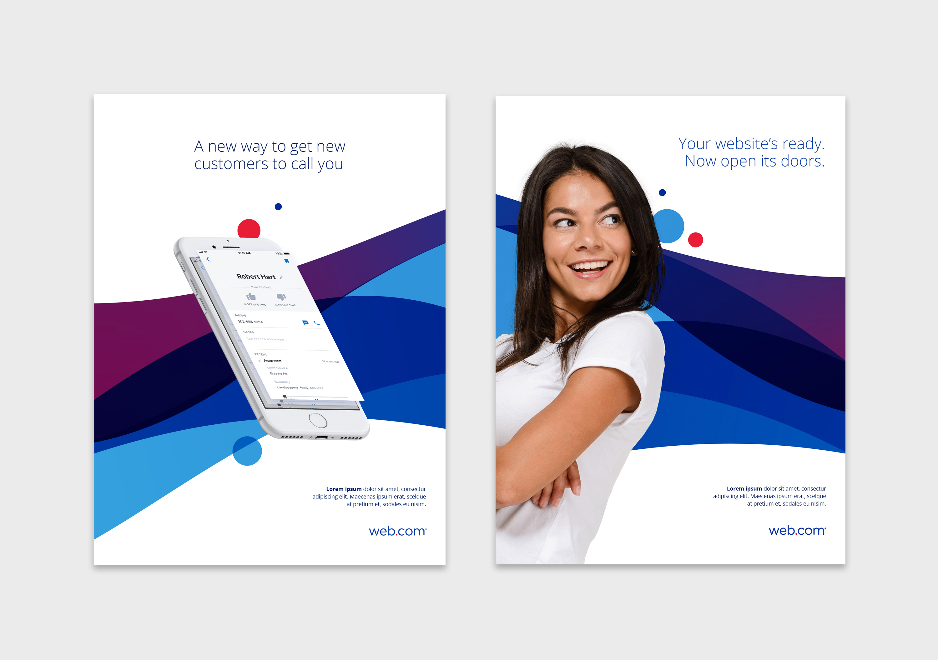
At the center of the visual identity was a system of wave forms representing the connection between Web.com and its clients, and the connections those clients create with their own customers. The shapes conveyed a sense of momentum and empowerment, making the idea of connection feel fluid, accessible, and intuitive.
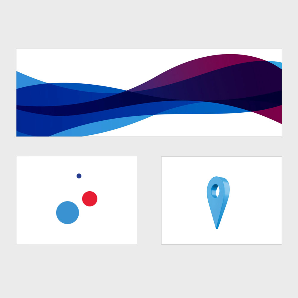
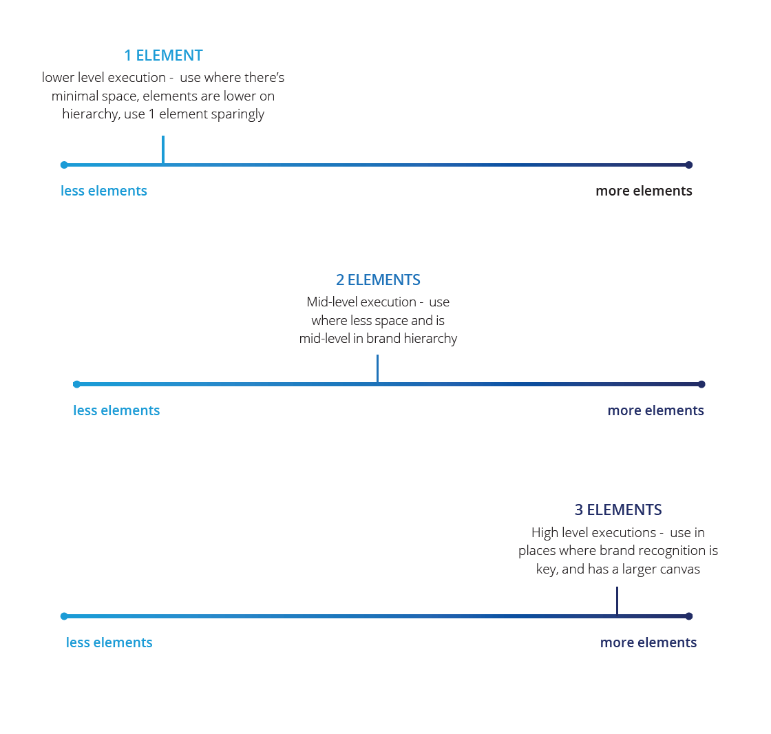
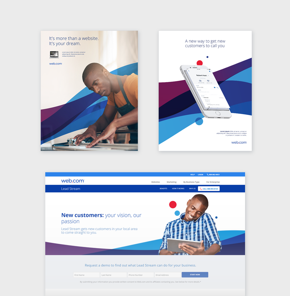
The system was built from three core elements: overlapping waves, circles or "dots," and dimensional contextual icons. Drawing from the existing dot motif, we developed three distinct wave forms by cropping and reshaping circular elements. Gradients drawn from the new primary palette added depth and sophistication, while a complementary plum tone helped bridge the blues with the brighter red used in the logo's dot and dimensional iconography. Together, these elements created a recognizable visual language that felt modern and distinctly Web.com.
Just as important as the look of the system was how easily it could be used. We developed a visual sliding scale to demonstrate how the three elements could be combined and applied across different contexts. This gave designers at every experience level a clear reference point, turning the identity into a practical creative toolkit rather than a set of restrictive rules.
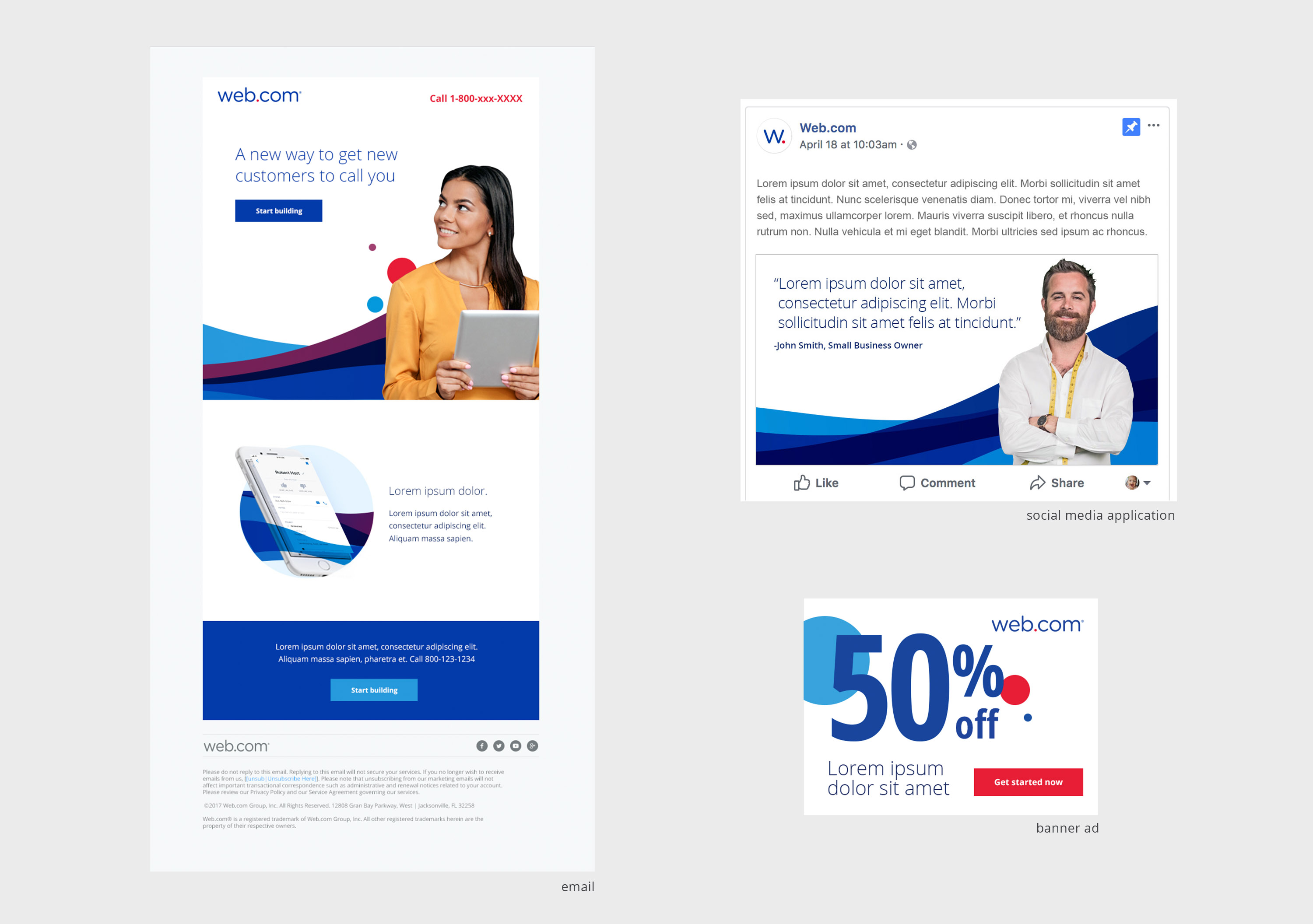
The resulting system was tested with users, with the wave forms, dots, and dimensional icons resonating as a fresh direction for the brand. The identity was then extended across digital applications, including email, social media, and banner advertising, demonstrating its flexibility and consistency across touchpoints.
The team delivered the complete set of brand assets and guidelines within an aggressive four-month timeline. The refresh received positive feedback from employees, board members, and executive leadership, while giving Web.com a more contemporary, differentiated identity and a flexible system to carry it forward.
Project type
Brand Strategy & Visual Identity Refresh
Date
2018
Location
Jacksonville, FL

01
Web.com Brand Strategy and Visual System

01

02

03

04

05

06

07

08
- Web.com Brand Strategy and Visual System
- Web.com Brand Strategy and Visual System
- Web.com Brand Strategy and Visual System
- Web.com Brand Strategy and Visual System
- Web.com Brand Strategy and Visual System
- Web.com Brand Strategy and Visual System
- Web.com Brand Strategy and Visual System
- Web.com Brand Strategy and Visual System
bottom of page